From the minute they wake up until the moment they go to sleep, consumers are constantly flooded with messaging promoting a variety of products and services. If you want your company to stand out, this is bad news. That’s where the power of branding comes into play.
Businesses primarily use branding to set themselves apart from the competition. However, building a strong brand image for your organization also involves communicating your company’s core principles to customers and prospects.
Customers want to know who you are and what you believe in. If you wish to connect with your audience, you have to be genuine. In fact, research indicates that 86% of consumers feel that authenticity is an important consideration when picking which brands to support. What will it take for them to support yours? This article will talk about branding inspiration that will emotionally connect with your audience and motivate them to take action.
Branding Inspiration: Where To Start
Building a solid brand takes time and effort. It’s not enough to simply pick your favorite colors and throw something together for a logo. You need to think strategically about your design to establish a brand that genuinely reflects your company and can evolve with you. Here are the steps for getting started with branding:
Do Your Research
Understanding your audience is the first step to creating a brand that speaks to them. As such, you need to spend some time getting to know your target market. Create profiles that reflect their personal preferences, interests, and values. Proceed to competition research if you have a solid grasp of your audience’s needs. Study your direct and indirect competition by searching for your product or service on Google. Research your competitors’ use of visual elements, personas, and themes to see how they’ve chosen to market themselves.
Determine Your Focus
You can’t expect your brand to appeal to everyone. As such, finding a focus and letting that guide the growth of the rest of your brand is essential. If you want your brand’s direction and tone to be clear, consider the following factors:
Positioning statement: Positioning statements consist of one or two sentences that assert a company’s claim in the market. It includes a concise description of a product or service and an explanation of how it meets a specific demand. A positioning statement aims to link a company’s brand and unique value proposition with its marketing initiatives.
Words that describe your brand: One way to approach brand development is to think of it as a person. This will help you develop your social media persona and the tone and voice of your creative work, whether written or visual. An enjoyable yet practical branding practice is to propose three to five words that characterize the kind of brand which might appeal to your audience.
Metaphors or concepts that characterize your brand: Putting your brand into metaphorical or personified form can assist you in discovering the unique characteristics you want it to have. Anything goes as long as it inspires the kind of impression that you’d like your brand to portray, whether it’s a car, an animal, an athlete, or something else.
Decide on Your Brand’s Visual Identity
It’s time to put all this new information into visual form. You’ll need to consider the colors and fonts you’ll use to visually reflect your brand.
Colors: Aside from defining the appearance of your brand, colors represent the emotions you want to express and help you keep them consistent throughout all your marketing efforts. To prevent confusing customers, you’ll want to pick colors distinct from those of your key competitors.
Fonts: Selecting the right typefaces can have a significant impact on the message your brand conveys. You can draw in your ideal customers by using fonts that match your brand’s principles, whether they are conventional or edgy, playful or professional.
Branding Ideas To Fuel Your Brand’s Inspiration
Looking for branding inspiration by searching for ideas on Google is an excellent first step. Although you might discover some nice examples, you’re likely to be flooded with images from shady websites. To make things easier for you, we’ve compiled creative, modern, and simple branding ideas and examples.
Creative Branding Ideas & Examples
Southwest

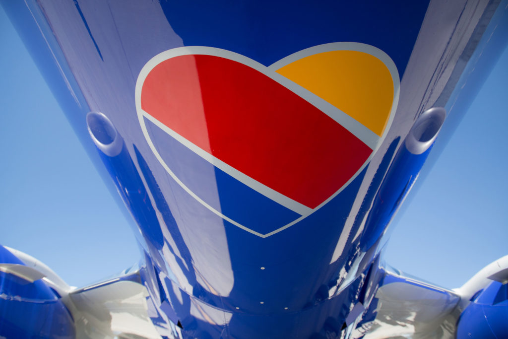
In the footsteps of Virgin, Southwest Airlines introduced a makeover that added a dash of personality to its brand. When you see the airline’s new color scheme of yellow, red, and blue, you immediately get a warm and inviting feeling, which is precisely what you expect from an airline.
While maintaining its reputation as a company that cares about its passengers, Southwest also wants to make a new, visually appealing way to appeal to new customers. To better reflect Southwest’s unique spirit and heart, the airline has overhauled its inflight magazine and materials and its website and airport locations. All these changes emphasize the airline’s commitment to customer service and highlight the new look’s remarkable uniform design and iconic logo, among other things.
Thinx

Branding is difficult for any product associated with menstruation because of the negative perceptions that surround it. Thinx‘s goal is to finally eradicate the stigma associated with menstruation. As a result, their content is unapologetically honest and aggressive in examining all things relating to sexuality and menstruation.
In their ad campaigns, they use creative imagery such as half-peeled grapefruits to represent vaginas and cracked eggs to represent an unfertilized monthly ovulation. This lighthearted and interesting tone is carried over to their social media pages.
Using their blog, aptly titled the Periodical, Thinx gives women the knowledge and tools they need to take control of their bodies and take pride in who they are. To build its brand around half of the population, Thinx places them at the very heart of its organization. Thinx has made clients feel like they’re part of a revolution shattering taboos by communicating with them.
Winter Milk

The Mexican ice cream parlor chain Winter Milk is built on the principle of using only natural ingredients. Nostalgic thoughts of family outings to an ice cream shop and high-quality products are evoked by the 60s-inspired brand identity.
The décor of their establishments reflects this vibe. Their palette includes the contrasting colors of orange and blue. Orange is a traditional color in the Netherlands, renowned for its high-quality dairy products, while blue gives the feeling of coolness. The rounded contours and understated lettering evoke the 1960s. With the company’s name placed inside a rhombus, the logo follows suit.
Modern Branding Inspiration & Examples
Mastercard

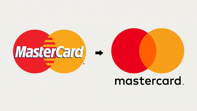
People are familiar with the Mastercard logo, which has two overlapping circles in the company’s characteristic red-orange-yellow colors. It’s hard to believe, but Mastercard’s brand identity has changed over the years. The company relaunched its brand in 2016 with a more modern look and feel. When it comes to rebranding, the key to success is to keep your audience’s familiarity with your brand’s core qualities and elements while injecting a fresh, contemporary feel into it.
This version retains the interlocking red and yellow circles that signify their connection, unity, and togetherness, but it’s flatter than the previous version and has a simpler font. Mastercard’s name has been rewritten without the capital “C” and, in other cases, just as “mastercard,” all lowercase letters. Card payments are now simply one form of payment among many, so this approach tries to downplay their significance.
RewardOps

Engagement ecommerce platform RewardOps was founded in Toronto, Canada, and is disrupting the rewards market. Its SaaS model, agile methodology, and cloud-hosted infrastructure set it apart from the competition in the loyalty sector. It’s evident from their bio that an organization with this much energy can’t be encompassed with just any branding. This is why they developed cutting-edge branding that breaks down borders and symbolizes their growing ambitions for the coming years.
The colors and patterns used in the logo and other marketing materials exude vigor and vitality. The brand message is electrifying, and this energy is sustained throughout the development of its brand image and online experience.
Weinheimer Leder

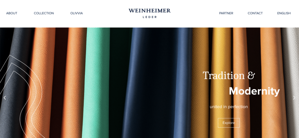
Weinheimer Leder is a calf leather manufacturer of the greatest quality, using only the finest raw materials for high-end brand shoes and leather goods. With the tagline “Tradition & Modernity united in perfection,” the company launched the brand’s 150-year history into the contemporary era.
Clear, straightforward forms and properly chosen colors are used to identify objects visually. It’s sophisticated and reflects the brand’s core principles of quality, precision, and transparency.
Simple Branding Ideas & Examples
Netflix

On-demand streaming provider Netflix has a strong reputation for its content, but that doesn’t imply that its branding has been overlooked. While Disney+ and other up-and-coming streaming services pose a threat to Netflix, it is more vital than ever for the streaming giant to maintain its distinct brand identity. Netflix’s logo, with its trademark red hue and large, clear text, has a simple design that suits its straightforward service offerings.
Even though Netflix’s logo may appear simple, it is used in a variety of creative ways across the company’s print and digital marketing materials, including as part of the branding for individual episodes and movies. Despite its simplicity, it can be used in many situations. It is easily scalable and adaptable to any channel.
Glossier

Glossier is a cosmetic brand dedicated to making the experience of makeup shopping as simple as possible. As a result, their branding is clear and straightforward. The use of people-centered images and light colors creates a pleasant and approachable atmosphere, which is consistent with their shopping experience.
However, even though Glossier is still mostly an online-only company, its site is so visually stunning that you won’t be able to take your eyes away from it. With accurate brand information and product descriptions, shoppers will feel immediately engaged.
Coleman Group

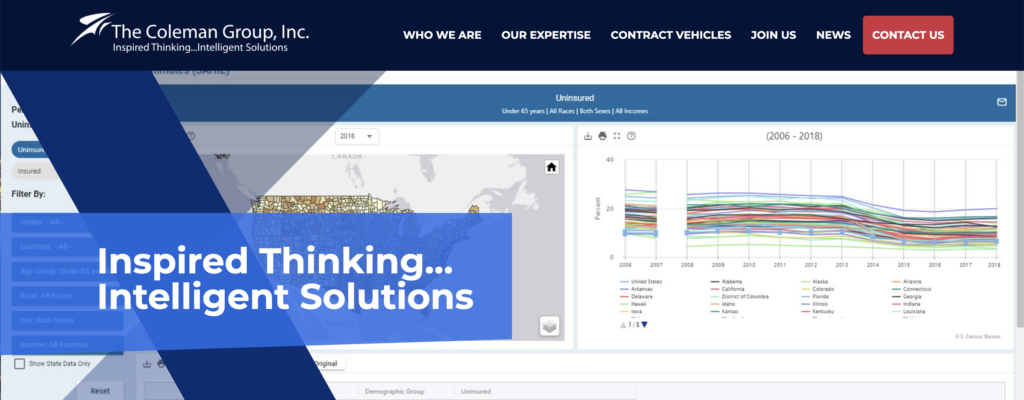
The Coleman Group is a network of real estate professionals in the greater Boston area specializing in residential and commercial properties. These professionals are well-known for their extensive market knowledge, in-depth understanding of the local industry trends, and hands-on approach to assisting clients in finding the most suitable property for their requirements.
The logo incorporates a basic yet powerful enclosure of the company’s initials but nevertheless maintains a light, open, and welcoming vibe. The intertwined parts are a metaphor for the complex relationship between the agent and the client. All the colors are monochromatic to make the design look clean and professional. The company’s free, out-of-the-box style is enhanced by using black and gray and subtle pops of color. The same branding and design techniques were used across all marketing assets and digital platforms, such as the completely responsive website, which is an excellent example of a professional yet simple user experience.
Does Your New Business Need New Branding?
When it comes to competition in today’s online world, the store down the street is no longer your only rival. You’ll compete with hundreds or even thousands of other businesses for attention online. If you want your company to stand out, you need to establish a strong brand. In this article, we have provided a wealth of branding inspiration and ideas to help you on your way.
Still having trouble with your company’s branding? Flyrise can help! We’re ready to transform your marketing with experts in branding, website development, social media marketing, email marketing, content marketing, and SEO. Let us get down and talk about your current issues to see how we can help. Get in touch with us here to get started!


